進行網站設,我們通常會被網頁排版難住,網站怎么樣才可以跳出固定思維的排版方式,大膽創,今天就來和大家聊一聊,網站設計中,我們應該如何選擇合適的排版方式。
When designing a website, we often encounter difficulties with webpage layout. How can a website break away from fixed thinking and innovate boldly? Today, let's talk about how to choose the appropriate layout method in website design.
在設計網站之前,我們首需要知道網站是怎么構成的,做網站一定離不開網頁設計,而網頁的布局則是整個網站設計中的重中之重,網站選擇什么樣的布局直接影響到訪客在瀏覽器上看到的整體頁面,網頁設計的好與不好也會直接影響到訪客在網站的停留時間長短。
Before designing a website, we first need to know how the website is composed. To create a website, web page design is essential, and the layout of the web page is the top priority of the entire website design. The layout chosen for a website directly affects the entire page that visitors see on the browser. The good or bad design of the web page also directly affects the length of time visitors stay on the website.
設在進行網頁設計布局前期,都會對客戶的需求進行整合和分布,達到良好的視覺效果,企業類型的網站一般可以分為三大類:功能型網站、形象型網站、信息型網站等,客戶需求不同采用不同的網頁設計方案,我們在進行網頁排版時,可以使用哪些技巧呢?
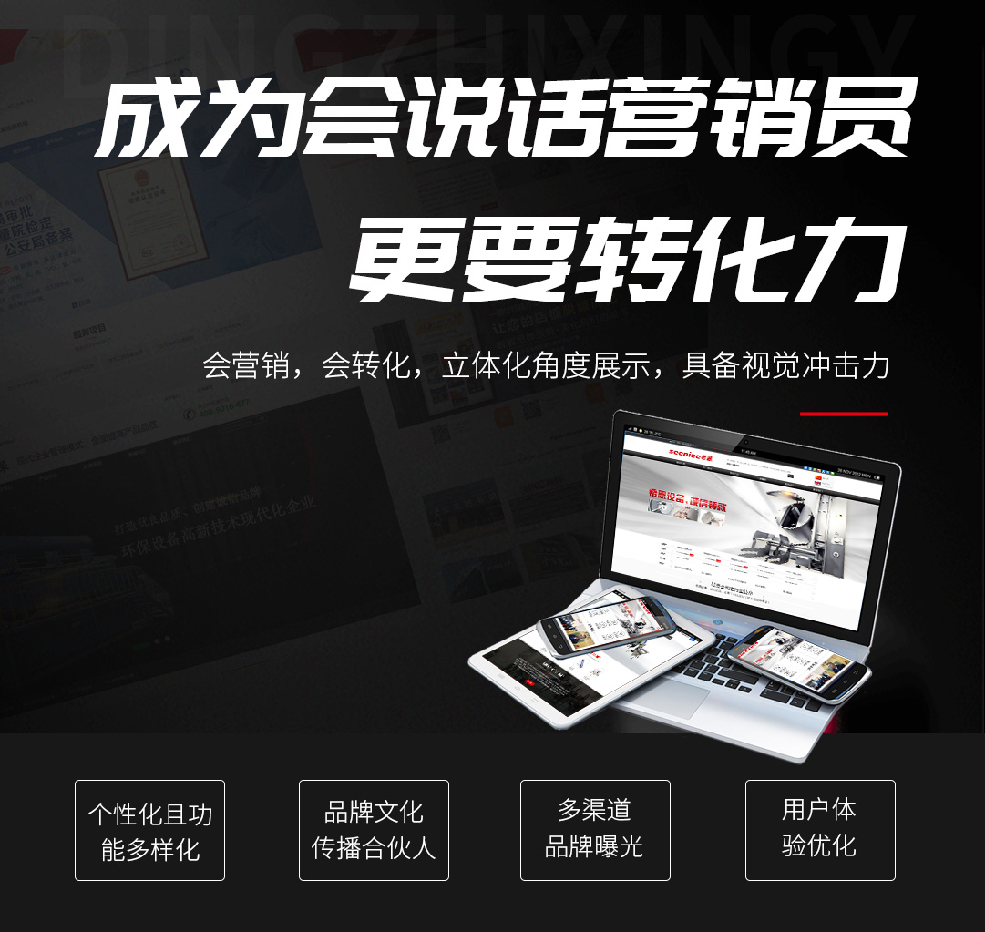
In the early stage of webpage design and layout, the needs of customers are integrated and distributed to achieve good visual effects. Enterprise type websites can generally be divided into three categories: functional websites, image websites, information websites, etc. Different webpage design schemes are adopted for different customer needs. What techniques can we use when webpage layout?
左文右圖,強調產品展示
Left text and right image, emphasizing product display
將文本和交互元素集中放在左側,將文本為主的信息整合到一起。則放在右側,上下貼近邊緣營造出通透感,整體布局簡約,圖文元素涇渭分明,整齊而清晰。
Centralize text and interactive elements on the left, integrating textual information together. Place it on the right side, with the top and bottom close to the edge to create a sense of transparency. The overall layout is simple, and the graphic and textual elements are distinct, neat and clear.
元素不再拘泥于特定的區域,而是互相交叉疊加排布,是當今的一個排版設計趨勢,文本和交叉疊加能夠營造出獨特的錯落感,不過在網頁設計中,我們需要注意畫面的平衡感。
Elements are no longer limited to specific areas, but instead cross and overlap with each other, which is a current trend in layout design. Text and cross and overlap can create a unique sense of dislocation. However, in web design, we need to pay attention to the balance of the image.
占據較大的空間,背景色和前景的圖文錯開,強化視覺層次,標題連接和文本兩個區域,將兩者關聯統一起來。
Occupying a large space, the background color and foreground text are staggered, enhancing the visual hierarchy, connecting the title and text areas, and unifying the two.
本示例網站由奕云企服制作
This sample website is created by Yiyun Enterprise Service
側邊欄列表,圖文疊加做主體
Sidebar list, with graphics and text overlay as the main body
對于大量并列的信息,側邊列表是非常有用的,可以快速篩選、選擇訪客需要的信息,內容可以統一采用圖文疊加的排版,加入按鈕、說明等其他輔助性元素,看起來豐富又不失功能性,需要注意的是控制好對比度,確保網頁的可讀性。
For a large amount of juxtaposed information, a side list is very useful, which can quickly filter and select the information that visitors need. The content can be arranged in a unified format with superimposed graphics and text, and other auxiliary elements such as buttons and instructions can be added to make it look rich and functional. The only thing to pay attention to is to control the contrast to ensure the readability of the webpage.
Thank you for reading. The source of this article is Jinan website construction. For more information and questions, please click on: http://www.qanho.com We will continue to work hard to provide you with services. Thank you for your cooperation


 727671696
 15508684333
 在線留言
在線留言